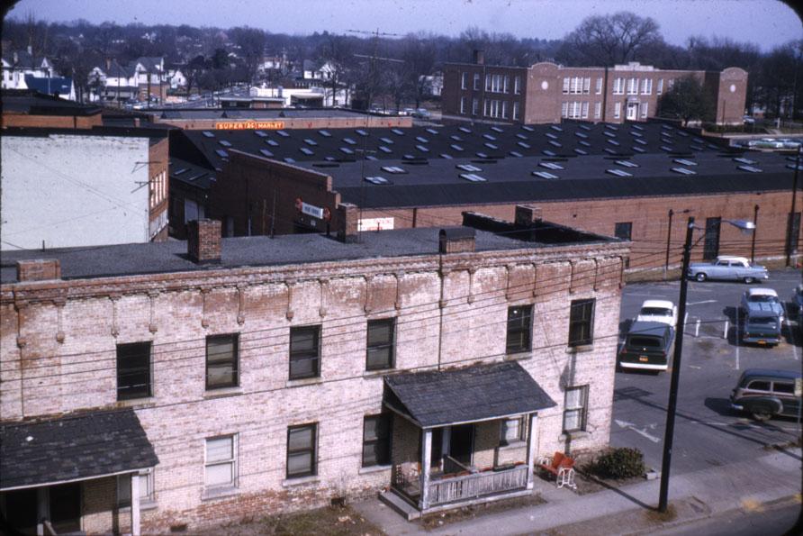
Bittman Apts, with the Planters Warehouse and Fuller school in the background - looking northeast from the 100 block of Holloway, 1963?
(Courtesy Durham County Library)
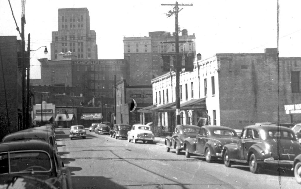
Looking west on Holloway St., 1950s (Courtesy Bob Blake)
Looking northeast from North Mangum and Holloway St., 1963?
(Courtesy Durham County Library)
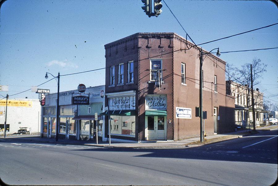
The east side of the 300 block of North Mangum St. and the north side of the 100 block of Holloway St. developed as a residential area during the late 1800s, which was supplanted by commercial buildings and apartments during the late 1910s / early 1920s. The Bittman Apartments, with its unique brickwork at the cornice must have been built by the same contractor who built 302 North Mangum, the building at the corner of North Mangum St. and Holloway St.
These buildings held on for a few years after the Planter's warehouse and northern portion of the block were demolished.
Looking east, 1964.
(Courtesy Durham County Library)
In 1964, they were demolished as well.
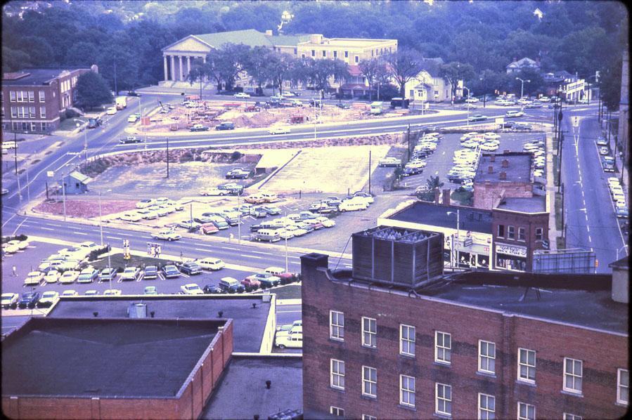
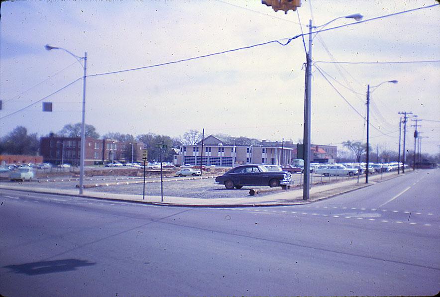
Looking northeast at the corner of Holloway and North Mangum, 1965.
(Courtesy Durham County Library)
This area was being developed per the grand vision of the Tarrant plan, Which envisioned a giant government complex on this site, with green space stretching westward. These ideas were picked up by the Durham Civic-Convention Center Commission, the Downtown Revitalization Foundation, and the Bell Design Group, which endorsed a new City Hall, a new Courthouse, and a new convention center to be built at Roney, Chapel Hill and Foster Sts.
For about 10 years, this land remained solely surface parking. However, through a Federal revenue sharing program (that I don't completely understand) Durham somehow managed to "get $25.4 million value out of an $11 million gift." This financed all of these buildings, and a slew of other infrastructure projects.
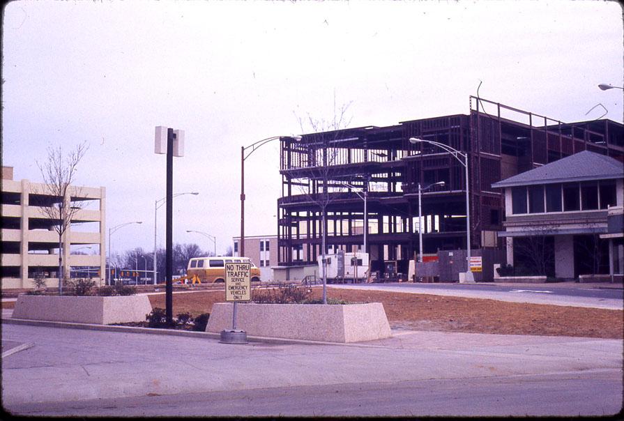
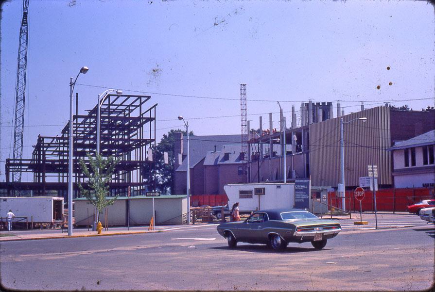
The city hall was begun in 1975.
Looking northeast, 1975.
(Courtesy Durham County Library)
Looking southeast 1975.
(Courtesy Durham County Library)
Looking west, 1975.
(Courtesy Durham County Library)
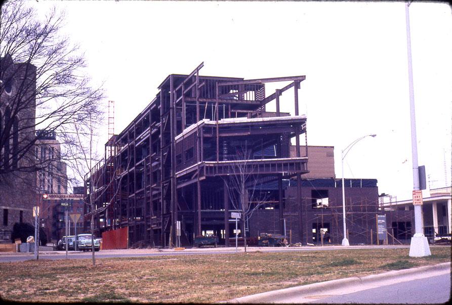
And was completed by 1978.
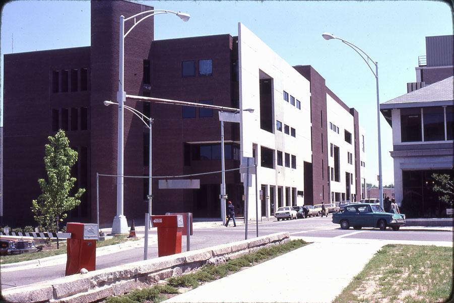
Looking northeast, 1978.
(Courtesy Durham County Library)
The old city hall on Morris St. was decommissioned, and became the home of the arts council. This remains the main city hall building.
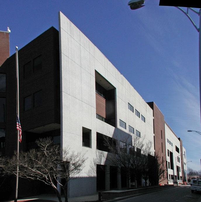
Looking northeast, 2006.
And man, it is a tough building to try to appreciate. I don't know who designed this building, but yikes. As I've said before, I do give them points for trying to make it interesting. But the strange facade, the metal railings, the tower, the round thing on the side that I assume was a parking exit - it's an odd silliness paired with an intensely imposing building. Frankly, looking at the pictures above, I can find some appreciation for the design. But the experience of walking by it is a completely different story. Ugh.
People have accused me of being anti-modern, or even anti-post modern (which is what I would call this.) I'm really not; but it seems that modernism and post-modernism have a greater capacity for sheer ugly to me than classical forms. Perhaps the greater freedom to design anything without rules can allow you to reach both great heights and dark depths of design.
I'm always cautious about wishing for a building's demise - am I making the same judgment that my predecessors did 50 years ago about the buildings I think were beautiful? It's hard to imagine with City Hall, simply because, whimsy aside, it is so out of scale to the area. Perhaps on a street full of skyscrapers it would be interesting (and, to be fair, I know that's how they envisioned the future Durham in the early 70s - all LeCorbusier.) Here, it's monstrously outsized and awkward.
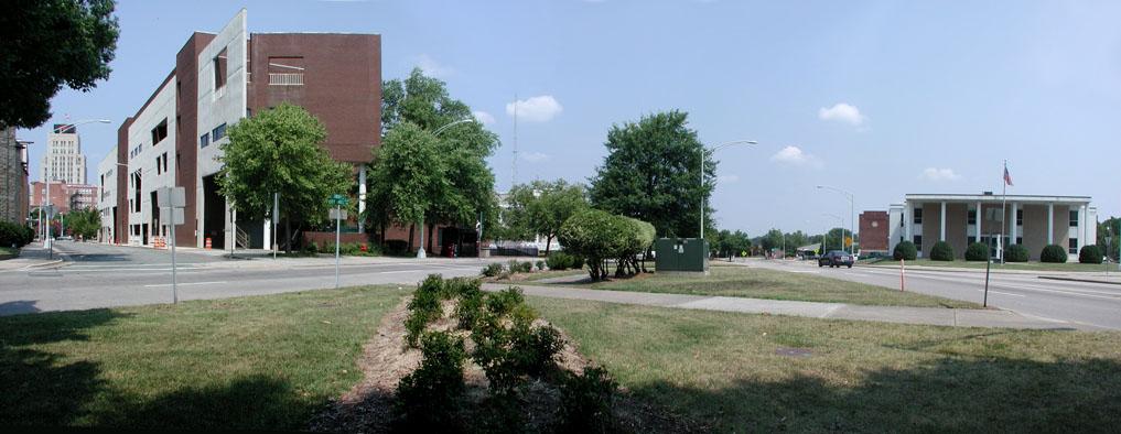
Standing near the former northwest corner of Holloway and Cleveland Sts., looking northwest, 2007

Comments
Submitted by Durhamite (not verified) on Fri, 1/6/2012 - 1:06pm
I remember thinking there was something ominous about this building when it was built in the 1970's. After passing through its shadow time after time, I realized that the ominous part was exactly that shadow. It always seems dark in the street in front of it, kind of like that street turned into a back alley...
Submitted by kwix on Mon, 1/9/2012 - 9:47am
This building affects me the same way -- it gives me the willies. It looms. It's like some black hole that sucks up the sun. Better suited to be the headquarters of some evil galactic empire than a town hall. I lived in Durham for several years wondering where the town hall was, and -- when I finally needed to do business there -- could not believe at first that this was really it.
I personally am a big fan of good modernist (and post-modernist, whatever that might mean at this point) architecture. This is not good modernism. To be sure, it is not without its limited virtues. I agree with you Gary, that one can certainly see efforts to make this an interesting building. And from what I can recall, the interior works pretty well, in a shopping-mall kind of way. It might have worked better in a different space.
But this building suffers from two big problems:
1) It relates horribly to the street. First, there is that looming ominosity problem. Second, it does not fit well into its urban space. It is smashed up against the No Man's Land of the Loop like some dead-end cul-de-sac; it looks like some large, angular beast that is trying to hide in the shadows. Third, it offers no easily accesible pedestrian space or access. And there is no clear entrance -- or even a clear front side to the building. Every side of this building looks like it might be the back entry. Finally, there is the problem of that blatantly fake facade -- a wonderful post-modern jest perhaps in another context, but here -- with its fake windows and such -- it just contributes to the overall sense of deception, hiding, confusion, lack of focus -- not really qualities one thinks that the City Fathers and Mothers would want associated with their work.
2) There is nothing about this building that indicates its function as a public building -- as a building of, by and for the people of the city. It looks like a non-descript office or warehouse. While I completely agree that the old standard model of the symmetrical, columned and corniced city hall is pretty stale at this point, there are some aspects of it that you need to retain if you are to have a city hall that gives a sense of community and vision to its city. One doesn't have to have a traditional grandiose, centered ceremonial front entry -- but one does need some kind of entrance which is appropriately gravitas-y to announce to citizens (and remind public servants) when they enter that there is something about this place and its work which isn't about business-as-usual, but about the community as a whole. And the building needs to relate to the city around it in a way that is open, that invites the public in (although perhaps that represents a distraction that our busy city workers were trying to prevent with this design...?), and that connects to other public and private spaces in a way that is positive and nourishing.
O.K., rant over. There are few buildings I feel strongly about -- I can see virtues in almost anything -- but apparently I have strong feelings about this one...! I just feel like Durham deserves better -- and could do better.
Add new comment
Log in or register to post comments.