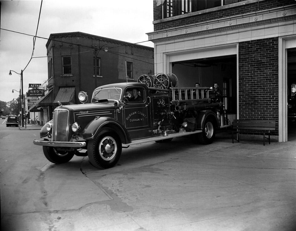
Looking north from Fire Station #1, 09.20.54.
(Courtesy The Herald-Sun Newspaper)
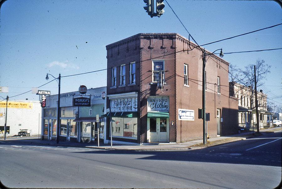
Looking northeast from North Mangum and Holloway St., 1963?
(Courtesy Durham County Library)
The east side of the 300 block of North Mangum St. and the north side of the 100 block of Holloway St. developed as a residential area during the late 1800s, which was supplanted by commercial buildings and apartments during the late 1910s / early 1920s. The corner building above, with its unique brickwork at the cornice must have been built by the same contractor who built the Bittman Apartments - directly to its east on Holloway.
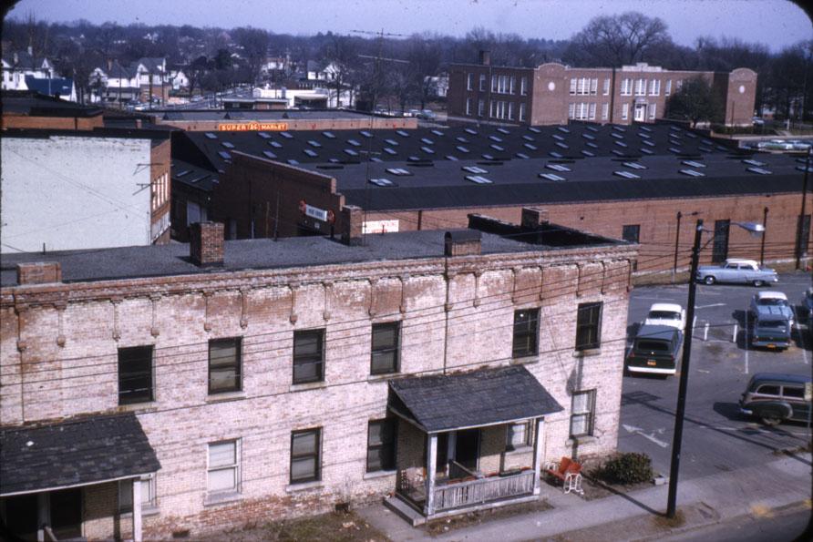
Bittman Apts, with the Planters Warehouse and Fuller school in the background - looking northeast from the 100 block of Holloway, 1963?
(Courtesy Durham County Library)
These buildings held on for a few years after the Planter's warehouse and northern portion of the block were demolished.
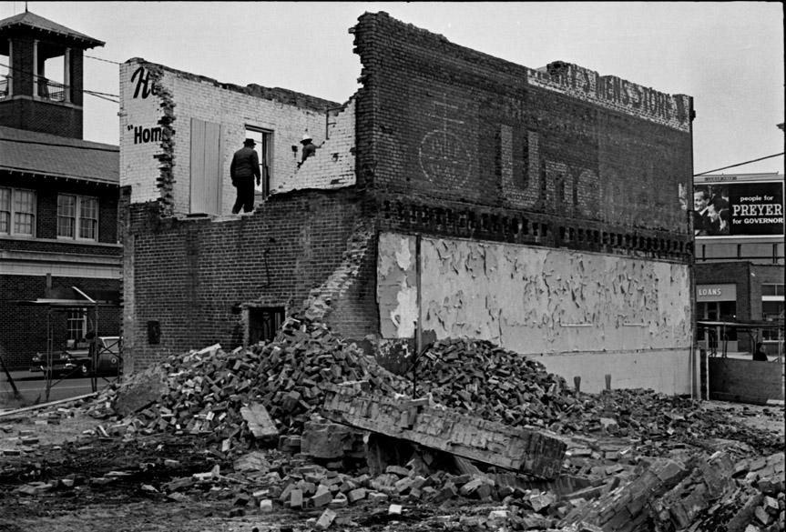
Looking east, 1964.
(Courtesy Durham County Library)
In 1964, they were demolished as well.
302-308 N. Mangum demolition, 02.12.64
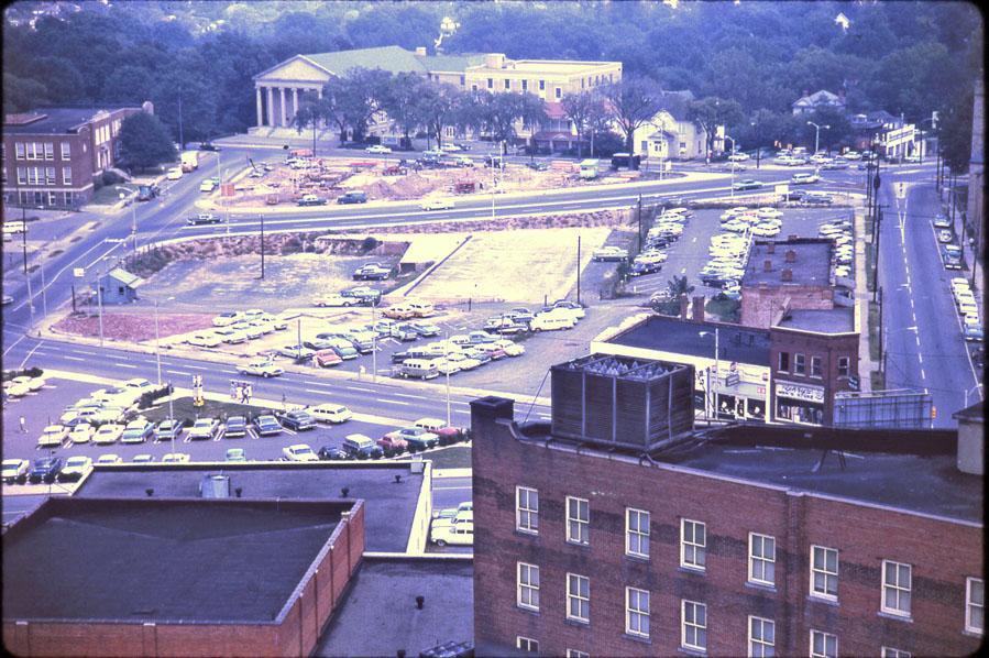
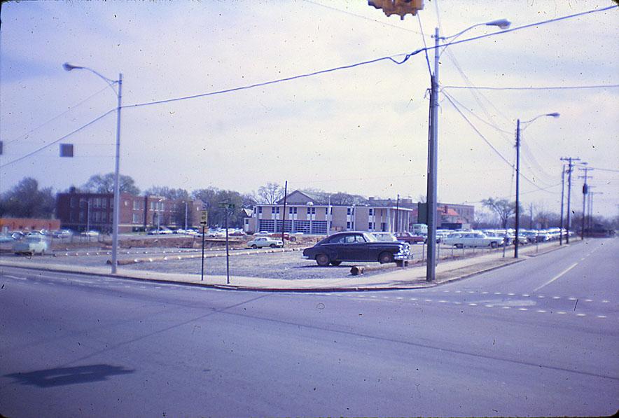
Looking northeast at the corner of Holloway and North Mangum, 1965.
(Courtesy Durham County Library)
This area was being developed per the grand vision of the Tarrant plan, Which envisioned a giant government complex on this site, with green space stretching westward. These ideas were picked up by the Durham Civic-Convention Center Commission, the Downtown Revitalization Foundation, and the Bell Design Group, which endorsed a new City Hall, a new Courthouse, and a new convention center to be built at Roney, Chapel Hill and Foster Sts.
For about 10 years, this land remained solely surface parking. However, through a Federal revenue sharing program (that I don't completely understand) Durham somehow managed to "get $25.4 million value out of an $11 million gift." This financed all of these buildings, and a slew of other infrastructure projects.
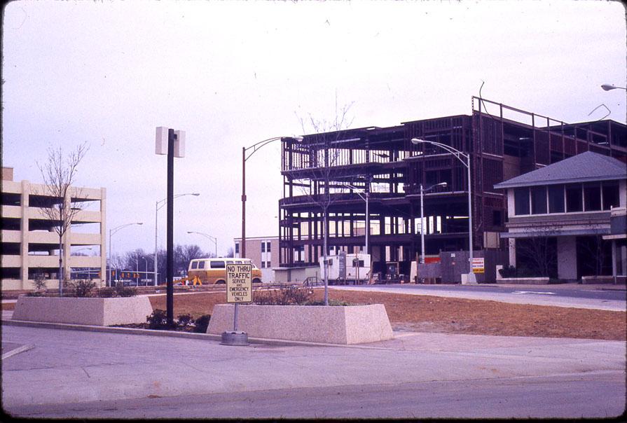
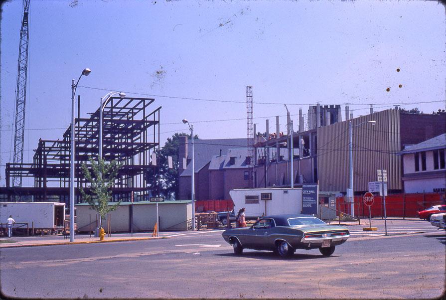
The city hall was begun in 1975.
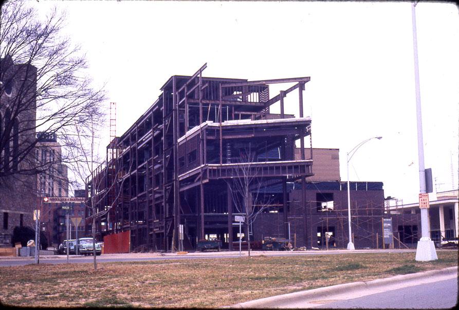
Looking northeast, 1975.
(Courtesy Durham County Library)
Looking southeast 1975.
(Courtesy Durham County Library)
Looking west, 1975.
(Courtesy Durham County Library)
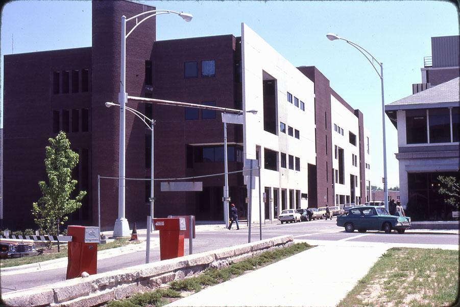
And was completed by 1978.
Looking northeast, 1978.
(Courtesy Durham County Library)
The old city hall on Morris St. was decommissioned, and became the home of the arts council. This remains the main city hall building.
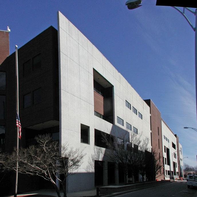
Looking northeast, 2006.
And man, it is a tough building to try to appreciate. I don't know who designed this building, but yikes. As I've said before, I do give them points for trying to make it interesting. But the strange facade, the metal railings, the tower, the round thing on the side that I assume was a parking exit - it's an odd silliness paired with an intensely imposing building. Frankly, looking at the pictures above, I can find some appreciation for the design. But the experience of walking by it is a completely different story. Ugh.
People have accused me of being anti-modern, or even anti-post modern (which is what I would call this.) I'm really not; but it seems that modernism and post-modernism have a greater capacity for sheer ugly to me than classical forms. Perhaps the greater freedom to design anything without rules can allow you to reach both great heights and dark depths of design.
I'm always cautious about wishing for a building's demise - am I making the same judgment that my predecessors did 50 years ago about the buildings I think were beautiful? It's hard to imagine with City Hall, simply because, whimsy aside, it is so out of scale to the area. Perhaps on a street full of skyscrapers it would be interesting (and, to be fair, I know that's how they envisioned the future Durham in the early 70s - all LeCorbusier.) Here, it's monstrously outsized and awkward.
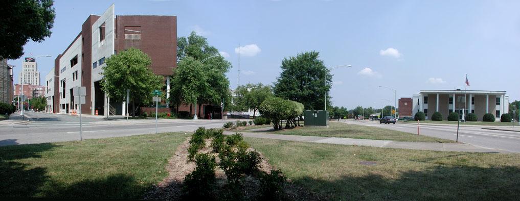
Standing near the former northwest corner of Holloway and Cleveland Sts., looking northwest, 2007

Comments
Submitted by Anonymous (not verified) on Tue, 7/24/2007 - 11:53am
It's a terrible building. Modern architecture can be warm and inviting. Look at the 1960s banks on Fayetteville Street in Raleigh with their totally glass street-level lobbies. But this building repels the public. I mean, it is even hard to figure out how to get inside the thing. New buildings don't have to be this bad.
Submitted by Gary (not verified) on Tue, 7/24/2007 - 1:28pm
Anon
I don't disagree, but what's interesting to me is that we continue to build ugly modern buildings. If the Human Services Complex is built as designed, it will be one. So I was interested to see, as someone who has always despised this building, that when I took pictures of it, it looked more interesting. So I'm wondering if therein lies the disconnect - dramatic modern structures that look daring and interesting in a rendering, but are clumsy, imposing - even hostile, and sterile in life. Since our public sector seems to be permanently endeared to modern/post-modernism (even as the private sector goes neo-traditional,) it's incumbent upon someone to realize the disconnect - that architects are either incapable of conveying the imposition of these structures upon the landscape, or unaware. The style that I call RTP-Pharmaceutical-Modern looks good on a grassy plain, but does not play well in the urban context.
GK
Submitted by Michael Bacon (not verified) on Tue, 7/24/2007 - 4:10pm
I know that I'm in the minority among just about every downtown and urban enthusiast I've ever spoken with, but I have an odd attachment to this building, and I'd actually be sad to see it torn down. The face on City Hall Plaza is really unpleasant, I agree, even though the facing on it at least tried something other than Big Wall O' Glass, or worse, Big Wall O' Concrete or Big Wall O' Stucco. While there's no denying that the Great Cylinder of Power is incredibly goofy and weird, I kind of like it. (I wish it had windows in it, but I like it.) And there's something to be said for the stairstep backside of it, and the funky non-entrance entrance underneath the cylinder that leads to some interesting spaces, which Andrew Barko would probably term "spandrel spaces."
The biggest problem I have with it is, as you mention, the "how do you get in?" problem. That the southern side is the main entrance, swallowed in the backwater of the bastardized City Hall Plaza, I just find wrong. This is perfectly suitable for a back entrance, but as a main entrance, it's pathetic.
I've already stated my preferred solution, but I'll do it again. If the godawful Annex were torn down, and a building which truly worked in dialog with the street were built facing E. Chapel Hill and Rotary Park, I think this brick thing would work fine as a secondary annex-style building, with the current front entrance on CHP turned into a back door. That way, we could get a beautiful, neoclassical facade that really presented the face of city government to the street and to the passerby, and not lose what is otherwise a perfectly functional office building that, without the pressure of being The City Hall, might actually be considered to add an interesting touch to the cityscape.
For that matter, if nothing else, the interior layout would actually make it a phenomenally good art museum.
Submitted by Gary (not verified) on Tue, 7/24/2007 - 5:00pm
Michael
I should have mentioned your idea, because I thought it was a really good one. Freed from the mantle of City Hall, and transformed into the back entrance, I think this building could become the modern 'addition' onto the Neo-Classical structure with frontage on East Chapel Hill and North Mangum. I think urbanists could be more forgiving of this building in that context.
Unfortunately, I think even in that scenario, it turns the abandoned block of Holloway (City Hall Place) into a grim canyon. The importance/unimportance of that will depend on the fate of this street at whatever glorious time the Loop is improved - will it become a viable connection between the east side of town and the city center again?
GK
Submitted by John Martin (not verified) on Wed, 7/25/2007 - 3:27am
I think this building is a nearly perfect visual reflection of the Durham city government.
Think about that.
Submitted by Anonymous (not verified) on Thu, 7/26/2007 - 6:51pm
If you think it's ugly to look at, trying working in it. Whoever designed the lobby, a huge volume of wasted and energy inefficient space, should be forced to restart design school.
And I'm not going to take the bait on John's broad-brush statement about the 2000+ employees and seven elected officials who work hard for this community every day.
Mike Woodard
Submitted by Anonymous (not verified) on Sat, 7/28/2007 - 5:59pm
I'm surprised the visionaries on this blog wouldn't see the financial and functional legitimacy of adaptive reuse for the City Hall Annex. The service entry could be gutted/demolished to accommodate a three/four-story plus addition providing a building face on Holloway/Chapel Hill St. with retail/small office on the street level.
The non-entrance entrance could be configured into ADA-compliant entrance to City Hall, the annex and the redesigned inviting courtyard.
A sale-leaseback deal may work better for City Hall in the long-run and allow a private developer to redevelop and maintain the space over a period of time.
Just my thoughts on the discussion...
Khalid
Submitted by Gary (not verified) on Sun, 7/29/2007 - 1:55am
Khalid
Perhaps, although I'm not sure there is enough to City Hall Annex to make it reasonable/feasible to demolish part of it and build a usable streetscape on East Chapel Hill. But, in principle, I'm always for reuse of existing buildings if you can correct the parts that make them unusable.
GK
Submitted by Christopher (not verified) on Fri, 2/5/2010 - 4:36pm
So is the entrance on the corner of Mangum and City Hall Plaza actually the main entrance to the building? That's the one I went into the one time I've visited City Hall, but I wasn't sure if it was an incredibly poorly marked main entry, or if I'd stumbled upon some sort of side lobby.
Then there is that long staircase on the annex side--what does that lead to? It has the big "CITY HALL" signage above it, but the staircase is totally ADA incompliant unless there's a ramp or an elevator inside the giant cylinder. Not to mention that the big pine trees flanking the stairway, while attractive, obscure that large signage such that I totally missed the stairs and the sign as I was walking past.
Add new comment
Log in or register to post comments.