Support OpenDurham.org
Preserve Durham's History with a Donation to Open Durham Today!
OpenDurham.org is dedicated to preserving and sharing the rich history of our community. Run by our parent nonprofit, Preservation Durham, the site requires routine maintenance and upgrades. We do not ask for support often (and you can check the box to "hide this message" in the future), but today, we're asking you to chip in with a donation toward annual maintenance of the site. Your support allows us to maintain this valuable resource, expand our archives, and keep the history of Durham accessible to everyone.
Every contribution, big or small, makes a difference and makes you a member of Preservation Durham. Help us keep Durham's history alive for future generations.

Comments
Submitted by Anonymous (not verified) on Fri, 2/15/2008 - 4:16pm
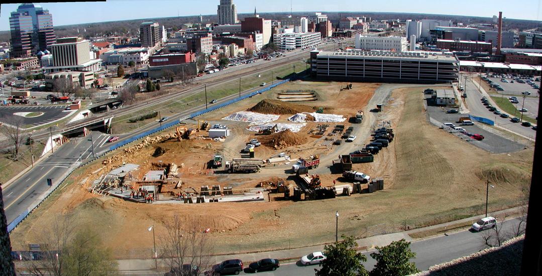
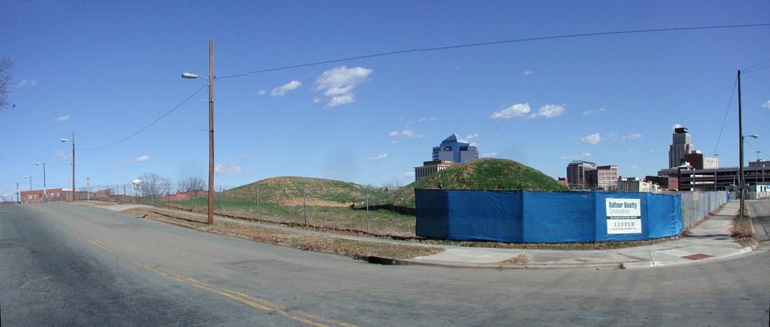
Whatever happened to the City's plans for an RFP from developers for mixed-use development on part of the bus station site? Haven't heard anything about that in many months.
Submitted by Bruce (not verified) on Fri, 2/15/2008 - 5:37pm
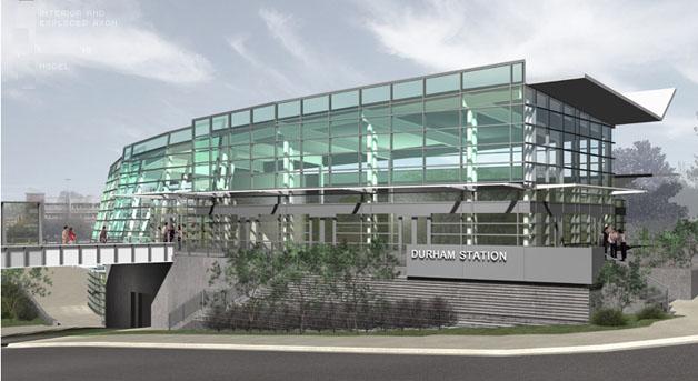
Ugh, another typical Freelon Group building- uninviting, fortress-style with lots of steel and windows. Not to mention the energy costs for a building with that many windows will be astronomical.
Submitted by coozledad (not verified) on Fri, 2/15/2008 - 5:55pm
The guys who drew the Jetsons could have done better than this. Do we need any more evidence that the cognitive development of human beings is pretty much finished?
I give this piece of rubbish about five years before someone's hawking velvet paintings out of it. It will, however, be a perfect match for the urine scent it will shortly acquire.
Submitted by Anonymous (not verified) on Fri, 2/15/2008 - 6:49pm
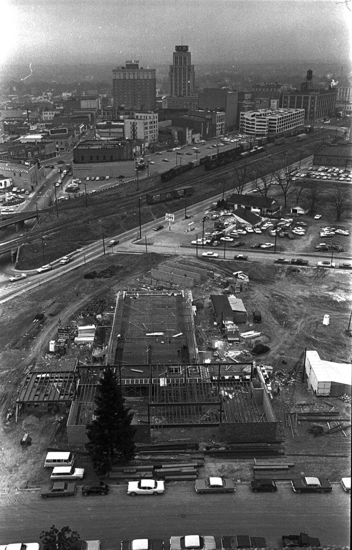
as Bruce said, what does this design mean for Durham's greenhouse gas targets, considering how much energy will be wasted to heat and cool it? Since every time I see that blank concrete wall under the "bridge," my brain immediately places graffiti tags there, maybe they should just make the entire thing a big concrete wall and then open it up for graffiti competitions. At least then it could be said to contribute to the local art scene.
Submitted by billozgtb (not verified) on Fri, 2/15/2008 - 6:55pm
I think the new bus station would look geat on it's own planet.It has no place here.Look at the buildings around it.For the N.C Mutual Building it's like being Miss Kittys Saloon in Dodge City in 1875.My wish for this city is that if we absolutely have to trash our neighborhoods we erect buildings that complement each other.
Submitted by Sean Lilly Wilson (not verified) on Fri, 2/15/2008 - 9:14pm
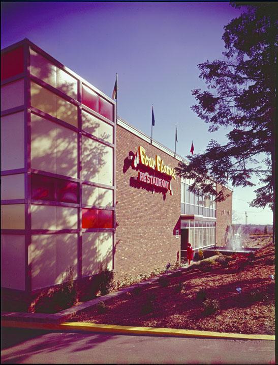
On a totally different note, I used to crank call the Four Flames restaurant and ask them to list the evening's four flames. Ah, good ol' drunk dialing.
Submitted by Jeremy T (not verified) on Fri, 2/15/2008 - 11:53pm
Maybe I'm crazy, but I actually really dig the contrast between the nearby renovated tobacco warehouses and the new modern style architecture of the future bus station. I guess I'm in the minority.
It's good to save historic structures where possible, but there was no historic structure here when the bus station was planned and designed. What sort of facility would you realistically like instead? Something totally generic, like a larger scale clone of the existing bus station? Some retro inspired pseudo-tobacco warehouse? Why not just let something new be new.
Oh, and the last I heard on the mixed use front was from this November post from BCR which made it sound like they were still shopping for a developer.
Submitted by Gary (not verified) on Sat, 2/16/2008 - 12:24am
Jeremy
Personally, I don't think it has to do with modernist vs. historic. To me, architecture should be beautiful and functional for a wide range of users - especially its primary users.
And I the primary users of this building as pedestrians - getting on and off the bus or in and out of cabs. And from what I can tell, this doesn't seem anything like a pedestrian-oriented building. What this looks like (and appears to be so far from the construction) is a big blank wall at the West Chapel Hill St. sidewalk level. That ain't good. The underpass and berms are dead enough for the pedestrians walking from inside the Loop without deadening the street more.
It's actually attractive - sitting in RTP up on a grassy knoll, it would be perfect. But it isn't urban, and it doesn't appear oriented to the primary infrastructure utilized by its user base.
GK
Submitted by Juanita (not verified) on Sat, 2/16/2008 - 1:01am
Gosh...I always loved that Four Flames sign.
Anyone know if it's in Peter's salvage or somewhere? I suppose it was just bulldozed.
I always hoped some savvy gay bar proprietor would snag it for a hip urban lounge.
Submitted by Chuck Clifton (not verified) on Sat, 2/16/2008 - 2:46am
As I have posted before (maybe not on ED), I think this would have been an excellent opportunity for the City of Durham to absolve itself of a past (and egregious) sin -- the destruction of Union Station. I fully appreciate the "let something new be new" sentiment. However, this was an opportunity to erect something consistent with the historical context while borrowing stylistic elements from this great piece of Durham's architectural past. Mark another missed opportunity for Durham -- where great things sometimes happen, when we bother to engage the community in meaningful discussions *before* we sign big contracts.
Submitted by Jeremy T (not verified) on Sat, 2/16/2008 - 3:27am
I suppose I'm just excited to see something happening on Chapel Hill between the freeway and downtown. I live on Burch Avenue and used to walk or bike this route to work daily, and let me tell you it's downright depressing - from my house you pass by the row of store front churches near Immaculata, the infamous mile-long overpass, various Sturdivant / Fields dilapidations, acres of surface parking surrounding the police department, the worst "transportation hub" I've ever seen, and at the end you're welcomed to downtown by the claustrophobic death tunnel under the railroad tracks. Given all that, the Jetson's bus stop seems like quite a treat, and maybe it's enough to get the ball rolling in the right direction.
I'm not normally a glass half full kind of guy, but I've got to feel thankful for anything here that isn't completely egregious, and I'm thinking this bus station fits that description. It definitely sucks if the Chapel Hill side of the station turns out to be stark and unapproachable as GK says, but hey - it could always be worse.
If it's any consolation, the Amshack is supposedly going away and the old warehouse on the other side of the tracks is rumored to be back on the slate as its replacement. I'm curious as to why they couldn't have put the Amtrack station and the taxi/bus station in the same physical facility, but seeing as how hard it's been to get any of this actually moving I feel thankful that we're getting anywhere at all.
Submitted by Gary (not verified) on Sat, 2/16/2008 - 5:01am
Jeremy, I live even closer to it than you do, and believe me, I'll happily be completely wrong if it is the lifeblood of West Chapel Hill and Willard. This horse is out of the barn, so we'll just have to hope that its far more inviting than it is on paper. I'm certainly happy to see the abandoned HOD replaced with something that will have a use. I just think we could have done better, and I hope, on future projects, we do.
It does sound like the Walker is back in play for the Amhouse. Now if TTA/Cherokee would get off their asses and redevelop the tracks/WCH/S. Duke triangle, we could have some serious life rekindled in the West End.
GK
GK
Submitted by Anonymous (not verified) on Sat, 2/16/2008 - 7:23pm
Has there been any serious discussion about the potential huge energy costs to the city of a building of this design with the walls of windows?
And I have to second Gary- this design is horrible in the way it shuts itself off from the street. Freelon Group was a bad choice for this site.
Add new comment
Log in or register to post comments.