Support OpenDurham.org
Preserve Durham's History with a Donation to Open Durham Today!
OpenDurham.org is dedicated to preserving and sharing the rich history of our community. Run by our parent nonprofit, Preservation Durham, the site requires routine maintenance and upgrades. We do not ask for support often (and you can check the box to "hide this message" in the future), but today, we're asking you to chip in with a donation toward annual maintenance of the site. Your support allows us to maintain this valuable resource, expand our archives, and keep the history of Durham accessible to everyone.
Every contribution, big or small, makes a difference and makes you a member of Preservation Durham. Help us keep Durham's history alive for future generations.

Comments
Submitted by Anonymous (not verified) on Mon, 9/13/2010 - 5:55pm
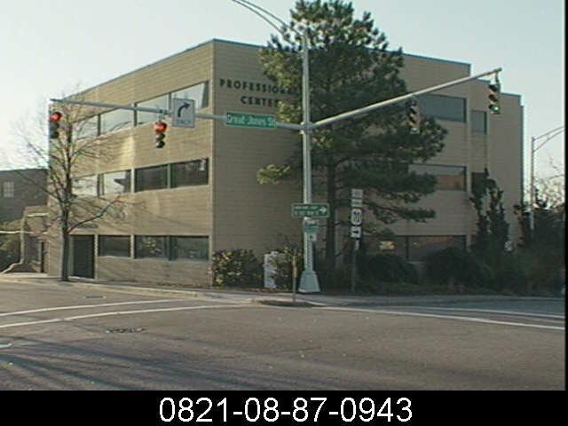
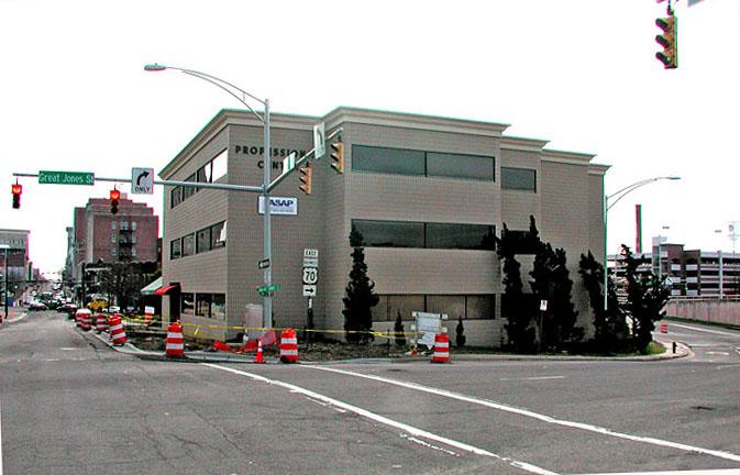
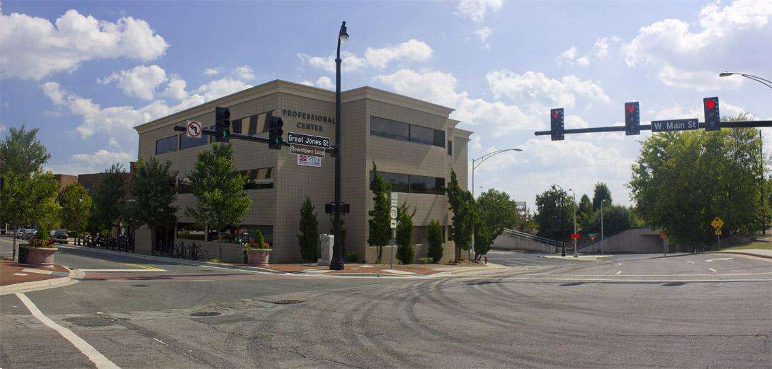
Gary, you don't have to be an "architectural purist" to note the absence of anything on the top of the 1970's version of the "Professional Center" building.
Even the Seagram Building ( http://en.wikipedia.org/wiki/File:NewYorkSeagram_04.30.2008.JPG ), perhaps THE personification of the International Style in the U.S., has some details at the top of the structure that hint at something of a cornice. Mies van der Rohe followed in the footsteps of Louis Sullivan and others, who realized that the office tower was nothing more than an oversized column, which for millenia has been expressed via a base, a shaft, and a capital.
Ok, you argue that the "Professional Center" isn't a tower. How about another icon of Modernist/International Style architecture: Gropius's Harvard Law School buildings. ( http://www.bluffton.edu/~sullivanm/tac/harvard6.jpg ). There's a cornice here, too. Its subtle, and it has been played with and manipulated, but it is clearly there.
So the original design of the "Professional Center" in Durham was indeed missing something, even following the "modernist" style. Modernist became the first excuse to thrown up a cheap box. And its not like the 2004 addition of cornice to the Professional Center was a case of adding "ye olde cornice" -- it is appropriate in scale and detail for the rest of the building.
Of course, from an urban design point of view, one wishes there was ground floor retail in this building, but until existing retail storefronts that are used as offices (even Scott Harmon's studio in five points!) are converted back to retail uses, its hard to complain about this one.
Submitted by Michael Bacon (not verified) on Tue, 9/14/2010 - 1:49am
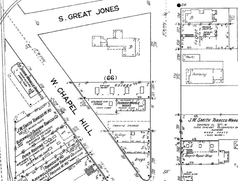
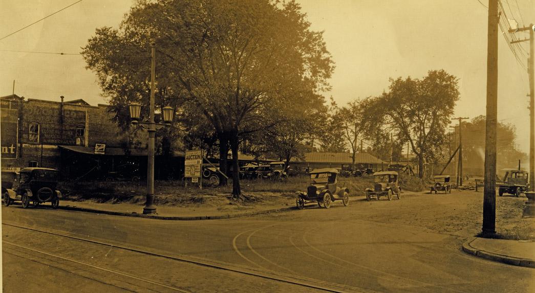
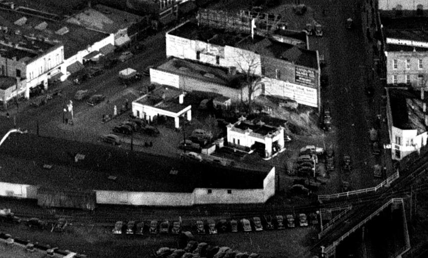
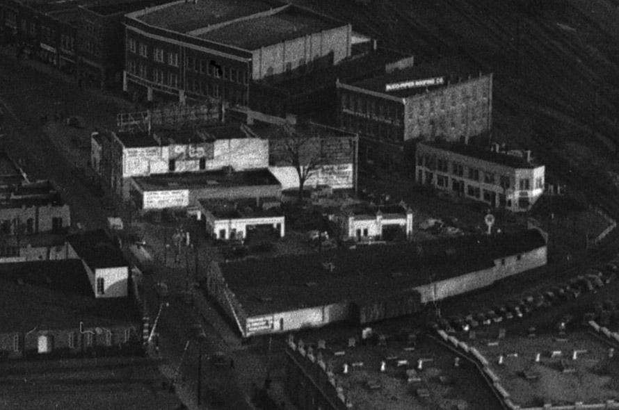
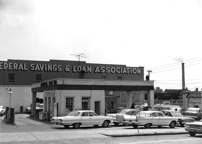
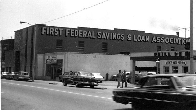
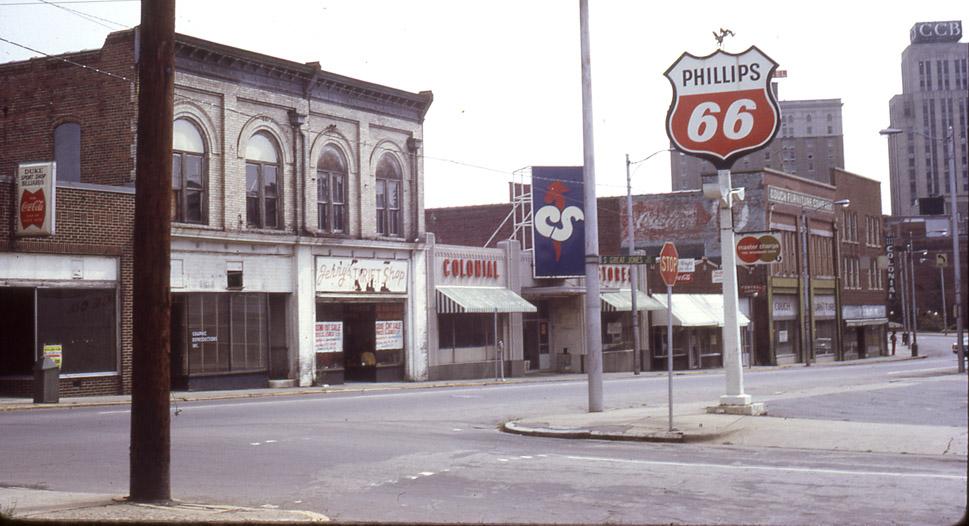
You know, this might be one of the few posts on Endangered Durham where I like the new significantly better than the old. I mean, it's not like the Professional Center is a gem, or anything, tearing down gas stations and replacing them with buildings built to the sidewalk is my idea of "progress."
Submitted by Gary (not verified) on Tue, 9/14/2010 - 4:02am
Anon
I did say I liked the cornice.... it's definitely far bulkier than what one would expect on a modernist structure, and clearly was not part of the original design.
But again, I like it - really.
GK
Submitted by Anonymous (not verified) on Tue, 9/14/2010 - 3:51pm
The cornice is re-writing architectural history into something more palatable though, don't you think?
Submitted by Onslow (not verified) on Mon, 9/20/2010 - 7:46pm
Guys, sorry, but the cornice doesn't change the building in any way for me... it's still hideous!
Add new comment
Log in or register to post comments.